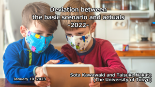
Research Results:RQ1_2022
Simulations for infection situations
Related reports
Organization
The Tokyo Foundation for Policy Research
Researcher
Asako Chiba
Organization
The Tokyo Foundation for Policy Research
Researcher
Asako Chiba
Organization
The Tokyo Foundation for Policy Research
Researcher
Asako Chiba
Organization
The Tokyo Foundation for Policy Research
Researcher
Asako Chiba
Researcher
Taisuke Nakata
Researcher
Taisuke Nakata
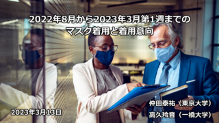
Mask wearing status and willingness to wear masks from August 2022 to the first week of March 2023
2023.03.16
Researcher
Taisuke Nakata
Researcher
Setsuya Kurahashi

Researcher
Akimasa Hirata
Researcher
Taisuke Nakata
Organization
The University of Tokyo (School of Engineering)
Researcher
Yukio Ohsawa
Researcher
Setsuya Kurahashi
Researcher
Yukio Ohsawa
Organization
Faculty of Science and Technology, Keio University
Researcher
Satoshi Kurihara
Researcher
Taisuke Nakata
Researcher
Setsuya Kurahashi
Researcher
Akimasa Hirata
Organization
The University of Tokyo (School of Engineering)
Researcher
Yukio Ohsawa
Researcher
Akimasa Hirata
Researcher
Akimasa Hirata

Researcher
Taisuke Nakata
Researcher
Taisuke Nakata

Organization
Faculty of Science and Technology, Keio University
Researcher
Satoshi Kurihara
Researcher
Akimasa Hirata
Researcher
Akimasa Hirata
Researcher
Taisuke Nakata
Researcher
Taisuke Nakata
Organization
Faculty of Science and Technology, Keio University
Researcher
Satoshi Kurihara

Researcher
Akimasa Hirata
Researcher
Akimasa Hirata

Researcher
Taisuke Nakata
Researcher
Akimasa Hirata
Organization
The University of Tokyo (School of Engineering)
Researcher
Yukio Ohsawa
Marriage and Birth in the Covid-19 Pandemic
2022.12.02
Organization
The Tokyo Foundation for Policy Research
Researcher
Asako Chiba
Organization
Faculty of Science and Technology, Keio University
Researcher
Satoshi Kurihara
Researcher
Akimasa Hirata
Organization
The University of Tokyo (School of Engineering)
Researcher
Yukio Ohsawa
Organization
The University of Tokyo (School of Engineering)
Researcher
Yukio Ohsawa
Researcher
Akimasa Hirata
Organization
Faculty of Science and Technology, Keio University
Researcher
Satoshi Kurihara
Researcher
Akimasa Hirata
Researcher
Setsuya Kurahashi
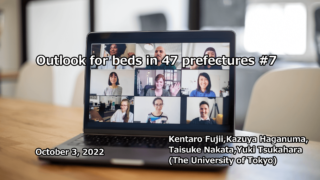
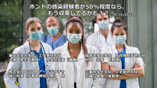
Possibility of spread of reinfection
2022.10.18
Organization
The University of Tokyo (School of Engineering)
Researcher
Yukio Ohsawa
Organization
The Tokyo Foundation for Policy Research
Researcher
Asako Chiba

Organization
Faculty of Science and Technology, Keio University
Researcher
Satoshi Kurihara
Researcher
Akimasa Hirata
Researcher
Taisuke Nakata
Organization
The University of Tokyo (School of Engineering)
Researcher
Yukio Ohsawa

Organization
Faculty of Science and Technology, Keio University
Researcher
Satoshi Kurihara

Researcher
Taisuke Nakata
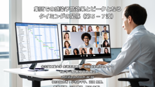
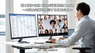
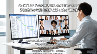
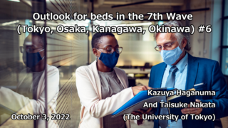
Relationship between infection prevention effect in a group and peak timing (5th-7th waves)
2022.09.13
Researcher
Akimasa Hirata
Organization
The University of Tokyo (School of Engineering)
Researcher
Yukio Ohsawa
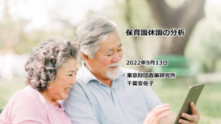
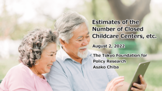
Analysis of nursery school closures
2022.09.13
Organization
The Tokyo Foundation for Policy Research
Researcher
Asako Chiba

Organization
Faculty of Science and Technology, Keio University
Researcher
Satoshi Kurihara
Researcher
Akimasa Hirata
Organization
The Tokyo Foundation for Policy Research
Researcher
Asako Chiba

Organization
Faculty of Science and Technology, Keio University
Researcher
Satoshi Kurihara

Researcher
Akimasa Hirata
Researcher
Taisuke Nakata
Researcher
Taisuke Nakata
Researcher
Taisuke Nakata
Researcher
Taisuke Nakata
Researcher
Setsuya Kurahashi
Researcher
Akimasa Hirata

Researcher
Taisuke Nakata

Researcher
Akimasa Hirata
Organization
The Tokyo Foundation for Policy Research
Researcher
Asako Chiba
Organization
The Tokyo Foundation for Policy Research
Researcher
Asako Chiba
Organization
Faculty of Science and Technology, Keio University
Researcher
Satoshi Kurihara
Organization
The University of Tokyo (School of Engineering)
Researcher
Yukio Ohsawa
Researcher
Setsuya Kurahashi
Researcher
Taisuke Nakata
Researcher
Taisuke Nakata

Researcher
Akimasa Hirata
Organization
The University of Tokyo (School of Engineering)
Researcher
Yukio Ohsawa
Researcher
Setsuya Kurahashi
Organization
The Tokyo Foundation for Policy Research
Researcher
Asako Chiba

Organization
Faculty of Science and Technology, Keio University
Researcher
Satoshi Kurihara

Researcher
Akimasa Hirata
Researcher
Taisuke Nakata
Researcher
Taisuke Nakata
Summary of empirical analysis on behavioral restrictions and information effects (fear effects)
2022.07.19
Researcher
Taisuke Nakata


Researcher
Taisuke Nakata

Organization
Faculty of Science and Technology, Keio University
Researcher
Satoshi Kurihara
Researcher
Akimasa Hirata
Organization
The University of Tokyo (School of Engineering)
Researcher
Yukio Ohsawa
Researcher
Setsuya Kurahashi
Researcher
Tatsuo Unemi
Researcher
Akimasa Hirata
Researcher
Setsuya Kurahashi
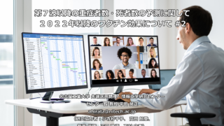
Forecast of severe illness rate, case fatality rate and hospitalization rate during the 7th wave
2022.07.05
Researcher
Taisuke Nakata

Researcher
Akimasa Hirata
Organization
The University of Tokyo (School of Engineering)
Researcher
Yukio Ohsawa

Organization
Faculty of Science and Technology, Keio University
Researcher
Satoshi Kurihara
Researcher
Taisuke Nakata
Researcher
Taisuke Nakata

Researcher
Akimasa Hirata
Organization
The Tokyo Foundation for Policy Research
Researcher
Asako Chiba
Organization
Faculty of Science and Technology, Keio University
Researcher
Satoshi Kurihara
Researcher
Akimasa Hirata

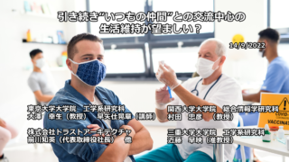
Even if the scope is expanded to Tokyo and 3 prefectures, is it safe to meet usual friends?
2022.06.07
Organization
The University of Tokyo (School of Engineering)
Researcher
Yukio Ohsawa
Organization
Faculty of Science and Technology, Keio University
Researcher
Satoshi Kurihara
Researcher
Taisuke Nakata

Researcher
Taisuke Nakata
Researcher
Taisuke Nakata
Organization
Faculty of Science and Technology, Keio University
Researcher
Setsuya Kurahashi
Researcher
Akimasa Hirata
Policy of phase 3 initiatives
2022.05.10
Organization
The University of Tokyo (School of Engineering)
Researcher
Yukio Ohsawa